The San Jose clash had a perfect kit ot fit the team's nae. The picture says it all.
9. Burn these, please

Maybe it was just the Burn logo going across the front that made the early Dallas kits look so terrible, but it's safe to say that the change to FC Dallas has helped the looks of the franchise drastically.
8. Problems for the Fusion
The Miami Fusion never really found a place in Major League Soccer, and the kit choice may have been part of the club's undoing.
7. Starting the Revolution

Going patriotic seemsto be the way of theteams in Foxborough, but this kit choice took the idea abit too far. The newer Revolution kits aren't spectacular, but he more traditional desgins make the struggling team a bit easier to watch.
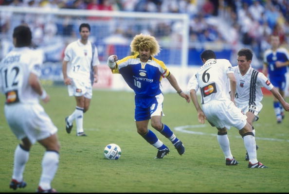
6. A Mutiny for your eyes
Tampa Bay has more than a couple style choices to look back on with shame(right Buccaneers Fans?) but the Mutiny's kit may take the cake.
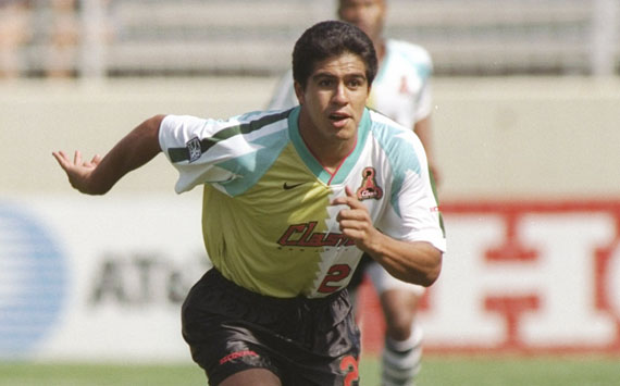
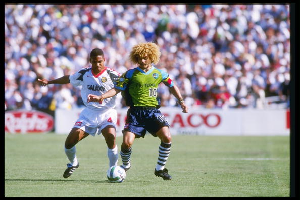
5. A Galaxy Apart

Compare and contrast the early Galaxy uniform with the current one, and it's easy to see just how far the league has come. From bright and slightly out of whack, to crisp and clean.
4. Bringing it back
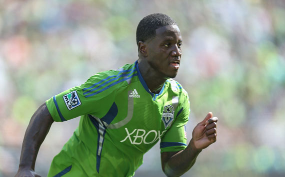
As the rest of the league began to work towards more traditional soccer style, the Seattle Sounders decided the league needed to get back to its roots. Thus,MLS is now the proud home of the only uniform in the world that is so bright it ca be seen from space.
3. The Bumblebee Crew
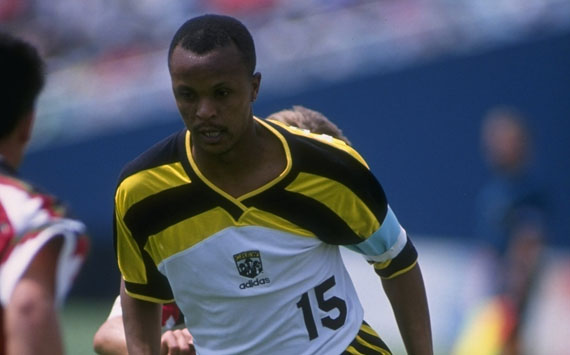
The Columbus Crew brought a lot to Major League Soccer with Crew stadium and an MLS title as well, but these kits from 1996 are likely a part of the club's history that the people of Ohio would like to forget.
2. The Wiz Kids

Whoever came up with this design was anything but a wiz.
1. Rapid change needed

Raise your hand if you're glad these are no longer the uniforms the Colorado Rapids wear.
沒有留言:
張貼留言